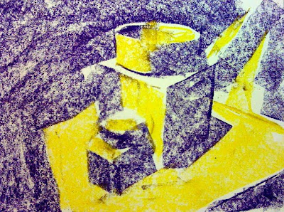
"warm" yellow for lights and "cool" purple for darks
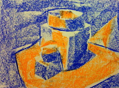
"warm" orange for lights and "cool" blue for darks
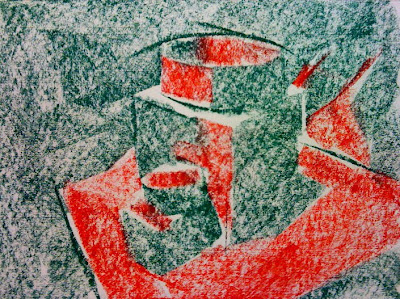
"warm" red for lights and "cool" green for darks
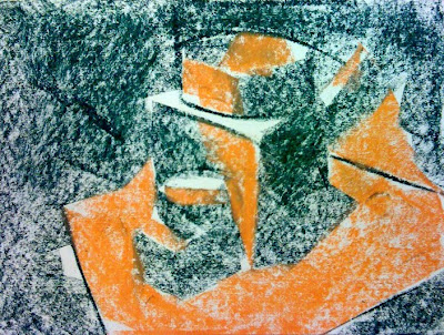
"warm orange for lights and "cool" green for darks
The two composite images below will illustrate the warm/cool light/dark idea further.
Make a special note of the red/green drawing. Our eyes read red as a warm color. We read warm colors as lighter, so the drawing works in color. BUT, notice what happens when the color is removed and only represented with gray tones (black/white). Both the red and the green have almost the same gray "value" so the drawing looks like a big field of gray.
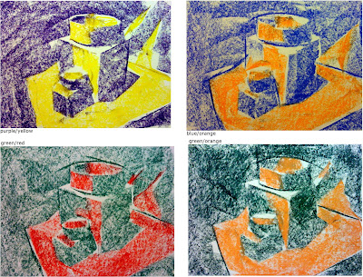
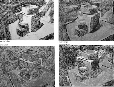
Since each color has a value in the grayscale, you can choose a warm color that has a lighter value and a cool color that has a darker value, and the drawing will work in both color AND black&white/grayscale terms.
For example: you can choose a lighter red (or even pink) to represent the lights and use a darker green to represent the shadows.
light yellow & dark purple
light orange & dark blue
light red & dark green
No comments:
Post a Comment