Here are four different videos that explain how to measure by sighting with your pencil. Essentially, you are looking down your arm, and placing your pencil on top of the object you wish to draw.
http://youtu.be/5gaJQRTxPSo
http://youtu.be/Vgw1CXghL5k
http://youtu.be/HHyixGBjg_E
http://youtu.be/T3PGcMxEHM0
Two main points you need to remember to start this technique....
1. Keep your arm straight, and outstretched fully. This allows you to have predictable results.
2. Only look with one eye (close the other one). If you are stretching out your right arm, then you only keep your right eye open. If you are using your left arm, then you only keep your left eye open.
Wednesday, September 12, 2012
Thursday, December 8, 2011
printmaking at FDU
Spring 2012
monotype technique example
http://youtu.be/Re7PMzGEReQ
monoprint with collage pieces
http://youtu.be/ajx3d7PTm68
inkjet transfer to wood
http://youtu.be/qWJx86ZxK5A
acrylic gel transfer from inkjet printer
http://youtu.be/cs8CvTFsFMU
anthotype example
http://youtu.be/H0qZLfbQVMM
Spring 2012
monotype technique example
http://youtu.be/Re7PMzGEReQ
monoprint with collage pieces
http://youtu.be/ajx3d7PTm68
inkjet transfer to wood
http://youtu.be/qWJx86ZxK5A
acrylic gel transfer from inkjet printer
http://youtu.be/cs8CvTFsFMU
anthotype example
http://youtu.be/H0qZLfbQVMM
Wednesday, November 2, 2011
cool colors vs. warm colors
Shadows tend to have a "cool" quality to them, while lights tend to have a "warm" quality to them. Keeping this in mind, you can begin to explore color by making a drawing with only two colors. Use a "cool" color to represent the shadows and a "warm" color to represent the light. (using compementary colors will augment the constrast and illustrate this point more)
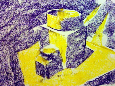
"warm" yellow for lights and "cool" purple for darks
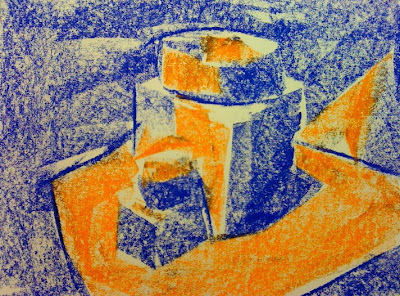
"warm" orange for lights and "cool" blue for darks
"warm" red for lights and "cool" green for darks
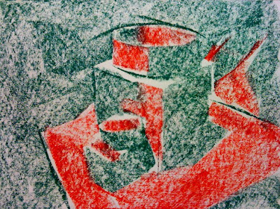
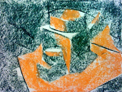
"warm orange for lights and "cool" green for darks
The two composite images below will illustrate the warm/cool light/dark idea further.
Make a special note of the red/green drawing. Our eyes read red as a warm color. We read warm colors as lighter, so the drawing works in color. BUT, notice what happens when the color is removed and only represented with gray tones (black/white). Both the red and the green have almost the same gray "value" so the drawing looks like a big field of gray.
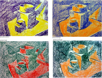
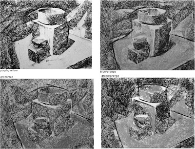
Since each color has a value in the grayscale, you can choose a warm color that has a lighter value and a cool color that has a darker value, and the drawing will work in both color AND black&white/grayscale terms.
For example: you can choose a lighter red (or even pink) to represent the lights and use a darker green to represent the shadows.
light yellow & dark purple
light orange & dark blue
light red & dark green
"warm" yellow for lights and "cool" purple for darks

"warm" orange for lights and "cool" blue for darks

"warm" red for lights and "cool" green for darks

"warm orange for lights and "cool" green for darks

The two composite images below will illustrate the warm/cool light/dark idea further.
Make a special note of the red/green drawing. Our eyes read red as a warm color. We read warm colors as lighter, so the drawing works in color. BUT, notice what happens when the color is removed and only represented with gray tones (black/white). Both the red and the green have almost the same gray "value" so the drawing looks like a big field of gray.


Since each color has a value in the grayscale, you can choose a warm color that has a lighter value and a cool color that has a darker value, and the drawing will work in both color AND black&white/grayscale terms.
For example: you can choose a lighter red (or even pink) to represent the lights and use a darker green to represent the shadows.
light yellow & dark purple
light orange & dark blue
light red & dark green
Tuesday, November 1, 2011

Wednesday, October 26, 2011
seeing SPACE and SHADOWS (with a pencil)
1. Define space on your page with only black and white (light and dark) by making hatch marks with your pencil.
Do NOT worry about accurate shapes of the individual objects. The point is to create an impression of space using light and dark.
you are encouraged to make more pencil marks than you think you should make.
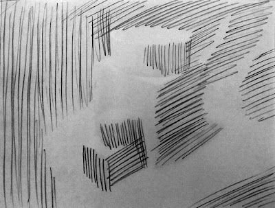
2. Take a moment to rough out the shapes of BOTH the foreground and background.
GENERALIZE the shapes geomentrically. This should only take a couple of minutes. Any longer and you are getting too much detail for this particular exercise.
Ultimately, the emphasis is on creating SPACE and developing detailed SHADOWS.
3. Continue working the shadows, darker and darker by making overlapping, or crossing hatch marks (called "cross-hatching").
Don't worry about preserving highlights.
You should have hatch marks on 95% of the page (or more).
Note how hatch marks roughly follow the direction of edges and help define shape.
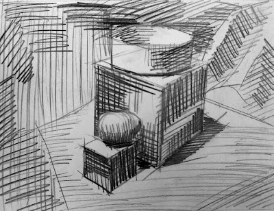
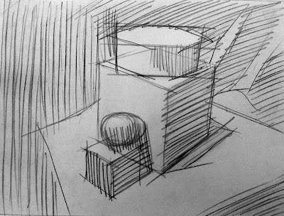
4. Darker and darker and darker.
How much information can you find within the shadows?
How many steps of dark gray and black are there?
Use your eraser to "pull" out the highlights.
(there should be VERY FEW areas of paper white)
Use the point of your pencil to make the darkest areas as dark as you can.
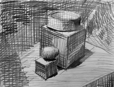
*** a note on this drawing....
it could easily be MUCH darker and have been worked for much longer, with more cross hatching; refining the shadows further, and being very careful about the placement and direction of lines that make up the hatch marks.
Each artist must decide how much:
CONTRAST
LINE QUALITY
DETAIL
Do NOT worry about accurate shapes of the individual objects. The point is to create an impression of space using light and dark.
you are encouraged to make more pencil marks than you think you should make.

2. Take a moment to rough out the shapes of BOTH the foreground and background.
GENERALIZE the shapes geomentrically. This should only take a couple of minutes. Any longer and you are getting too much detail for this particular exercise.
Ultimately, the emphasis is on creating SPACE and developing detailed SHADOWS.

3. Continue working the shadows, darker and darker by making overlapping, or crossing hatch marks (called "cross-hatching").
Don't worry about preserving highlights.
You should have hatch marks on 95% of the page (or more).
Note how hatch marks roughly follow the direction of edges and help define shape.

4. Darker and darker and darker.
How much information can you find within the shadows?
How many steps of dark gray and black are there?
Use your eraser to "pull" out the highlights.
(there should be VERY FEW areas of paper white)
Use the point of your pencil to make the darkest areas as dark as you can.

*** a note on this drawing....
it could easily be MUCH darker and have been worked for much longer, with more cross hatching; refining the shadows further, and being very careful about the placement and direction of lines that make up the hatch marks.
Each artist must decide how much:
CONTRAST
LINE QUALITY
DETAIL
seeing SPACE and SHADOWS (with pastel, conte, or graphite stick)
1. "Block In" your composition by thinking in terms of LIGHT, SHADOW, and SPACE.
Use the side of your pastel to cover your page quickly with anything that appears as even a slight shadow, leaving only the lightest areas untouched.
Accurately defining individual objects is NOT the point of this step.
You are defining SPACE!!!
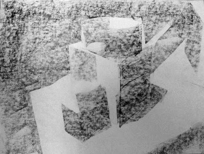
2. Work the background and foreground equally.
Treat important objects the same as unimportant ones as you develop at least three different types of darker gray.
Look closely.
What parts are supre dark?
What parts are the deepest, darkest parts?
What areas are in the middle?
Still defining SPACE at this stage of the exercise.
Still using the side and edge fo the pastel, conte crayon, or graphite stick, but NOT the tip of it.
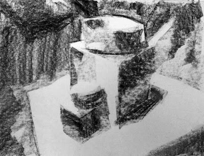
3. Find the shadows that are 100% black.
Use the point of your pastel and really work those to make sure they are 100% black.
Ask yourself if you have left too much area of your page as pure white ("paper white").
A few areas might need a very light touch to make a light gray surface.
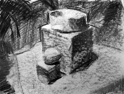
4. Now you can measure individual objects and adjust them for proportion/scale.
(remember, this is an exercise in space and shadow. That is why measuring individual objects is one of the LAST steps)
Use your eraser to bring out the few highlights that are pure paper white.
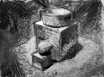
Drawing lines is optional.
You might want to leave the soft impression of pastel alone.
You may also choose to blend pastel with your finger to create and even softer feel to the drawing. (I'd caution you against over blending and making the whole thing appear "muddy")
Tuesday, October 25, 2011

Saturday, October 22, 2011


Subscribe to:
Posts (Atom)